

eBuy - Shopping App Case Study
eBuy - Shopping App Case Study
eBuy - Shopping App Case Study
Crafting seamless e-commerce experiences, One design at a time.
CLIENT
Self Case Study
TIMELINE
3 Weeks
SERVICES
E-commerce
WEBSITE
ebuy
MORE DETAILS

OVERVIEW
As a practice exercise to understand and refine the UX process, I designed a user-friendly e-commerce application. This hypothetical case study allowed me to approach a problem holistically using the 5-step UX design process: Empathize, Define, Ideate, Prototype, and Test. The goal was to ensure a seamless and delightful user experience while solving user pain points.
As a practice exercise to understand and refine the UX process, I designed a user-friendly e-commerce application. This hypothetical case study allowed me to approach a problem holistically using the 5-step UX design process: Empathize, Define, Ideate, Prototype, and Test. The goal was to ensure a seamless and delightful user experience while solving user pain points.
WHY E-COMMERCE?
E-commerce platforms are pivotal in today’s digital economy, and the user experience on these sites can make or break a business.
I chose this domain because it offers a variety of challenges—ensuring a seamless user journey, reducing friction during product discovery, and driving conversions through compelling design elements.
By working on this case study, I aimed to tackle real-world challenges that e-commerce businesses face in engaging and retaining customers.

PROBLEM STATEMENT
Online shoppers often face challenges such as overwhelming interfaces, difficulty navigating to desired products, and unclear purchase flows, which lead to frustration and abandoned carts. The goal of this project is to design an intuitive e-commerce experience that simplifies navigation, provides clear product information, and streamlines the purchase process to enhance user satisfaction and drive conversions.
Online shoppers often face challenges such as overwhelming interfaces, difficulty navigating to desired products, and unclear purchase flows, which lead to frustration and abandoned carts. The goal of this project is to design an intuitive e-commerce experience that simplifies navigation, provides clear product information, and streamlines the purchase process to enhance user satisfaction and drive conversions.
PROCESS & APPROACH
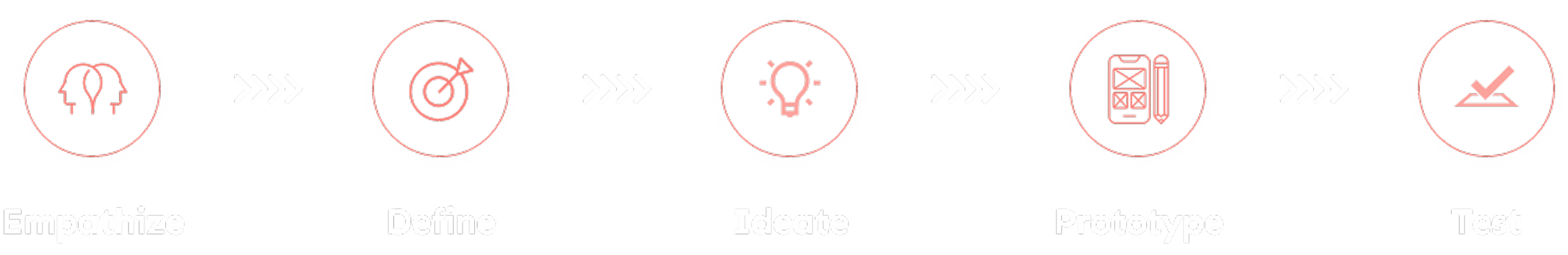
I followed the 5-step UX process—Empathize, Define, Ideate, Prototype, and Test—to create a seamless e-commerce experience. By understanding user needs through empathy mapping I defined key pain points, like complicated navigation. I then ideated a clear user flow, focusing on intuitive navigation and simplified choices. Using low and high-fidelity prototypes, I iterated based on user feedback, adhering to UX laws like Fitts’s and Hick’s Law to ensure usability and efficiency.
I followed the 5-step UX process—Empathize, Define, Ideate, Prototype, and Test—to create a seamless e-commerce experience. By understanding user needs through empathy mapping I defined key pain points, like complicated navigation. I then ideated a clear user flow, focusing on intuitive navigation and simplified choices. Using low and high-fidelity prototypes, I iterated based on user feedback, adhering to UX laws like Fitts’s and Hick’s Law to ensure usability and efficiency.
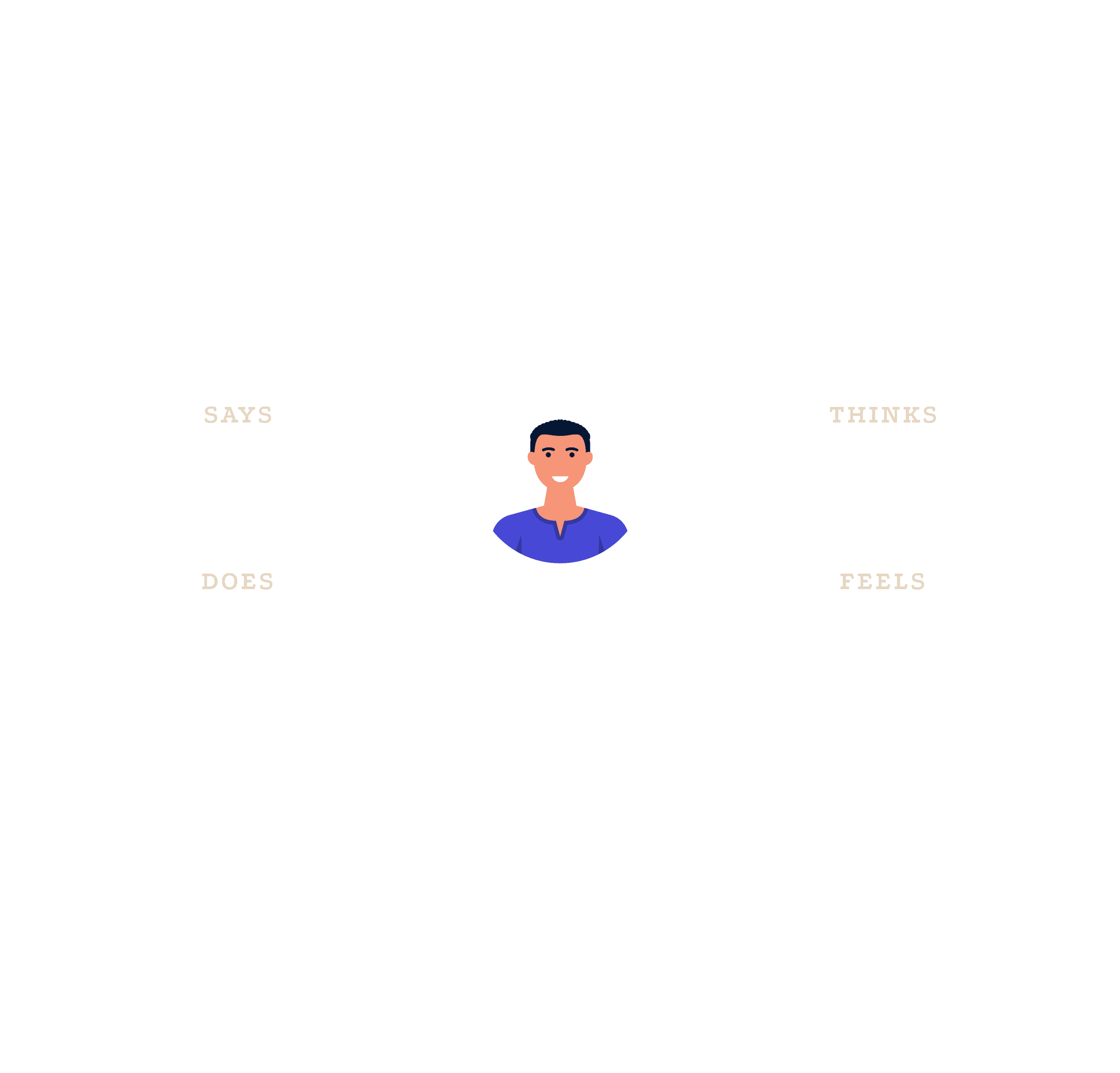
1. EMPATHIZE
To step into the users' shoes, I created an empathy map by considering myself as the target audience. Key insights included:
Seamless navigation and quick access to products are critical for a good experience.
Users often feel overwhelmed by cluttered interfaces.
These insights helped me define the foundation for a clean, minimal design focused on ease of use.
2. DEFINE
Based on the empathy map, I identified some common key pain points including navigation struggles, clarity of information, friction in purchase flow etc.
Based on the empathy map, I identified some common key pain points including navigation struggles, clarity of information, friction in purchase flow etc.

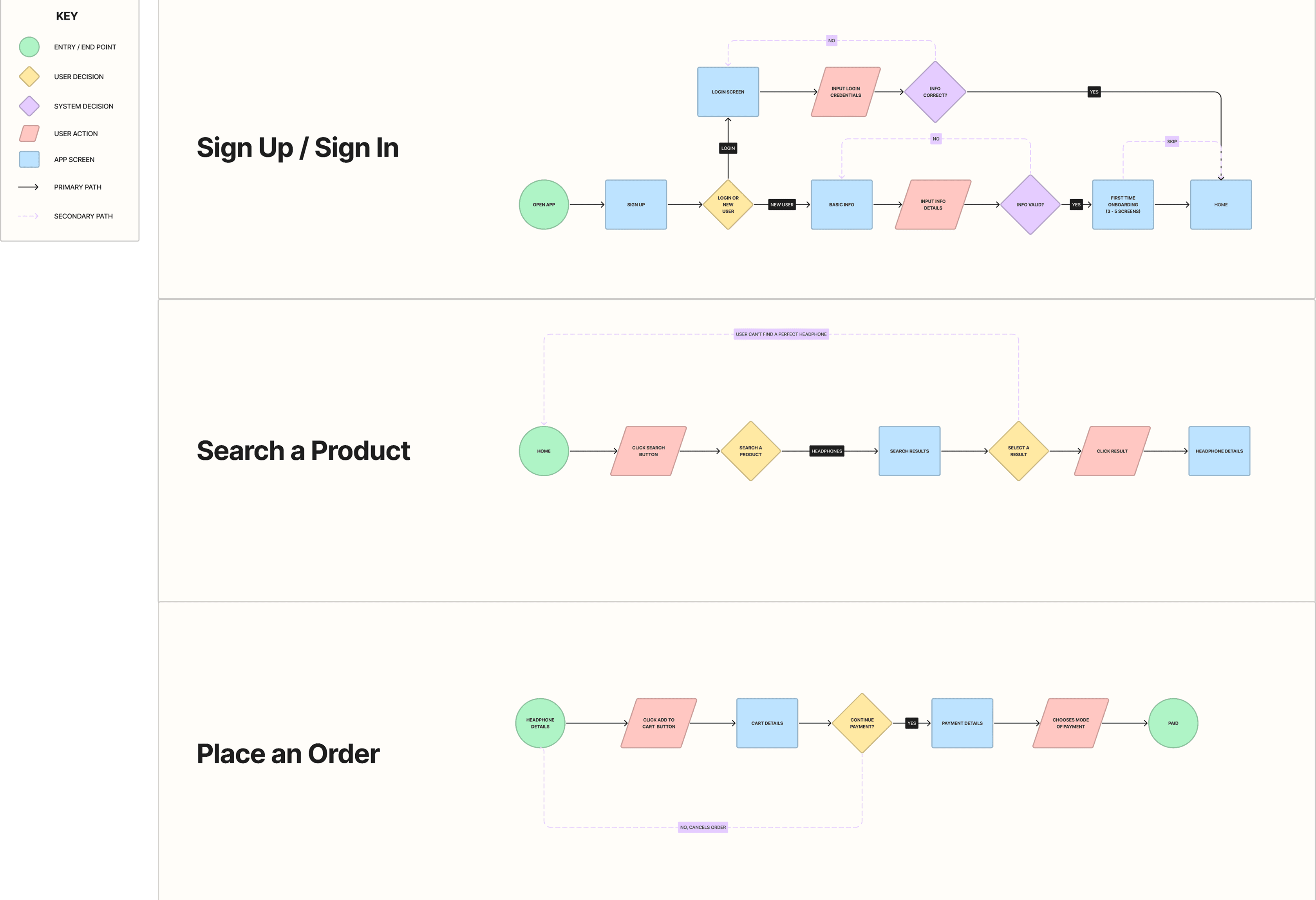
3. IDEATE
To address these pain points, I crafted a user flow map that outlined the entire journey from landing on the app to completing a purchase.
Key elements of the user journey:
Easy access to core features through bottom navigation on all screens.
A well-structured home screen with a menu and notification icon for engagement.
Clear segmentation of the product page, highlighting critical sections like images, descriptions, variants, and a prominent "Buy Now" CTA.
To address these pain points, I crafted a user flow map that outlined the entire journey from landing on the app to completing a purchase. Key elements of the user journey:
Easy access to core features through bottom navigation on all screens.
A well-structured home screen with a menu and notification icon for engagement.
Clear segmentation of the product page, highlighting critical sections like images, descriptions, variants, and a prominent "Buy Now" CTA.
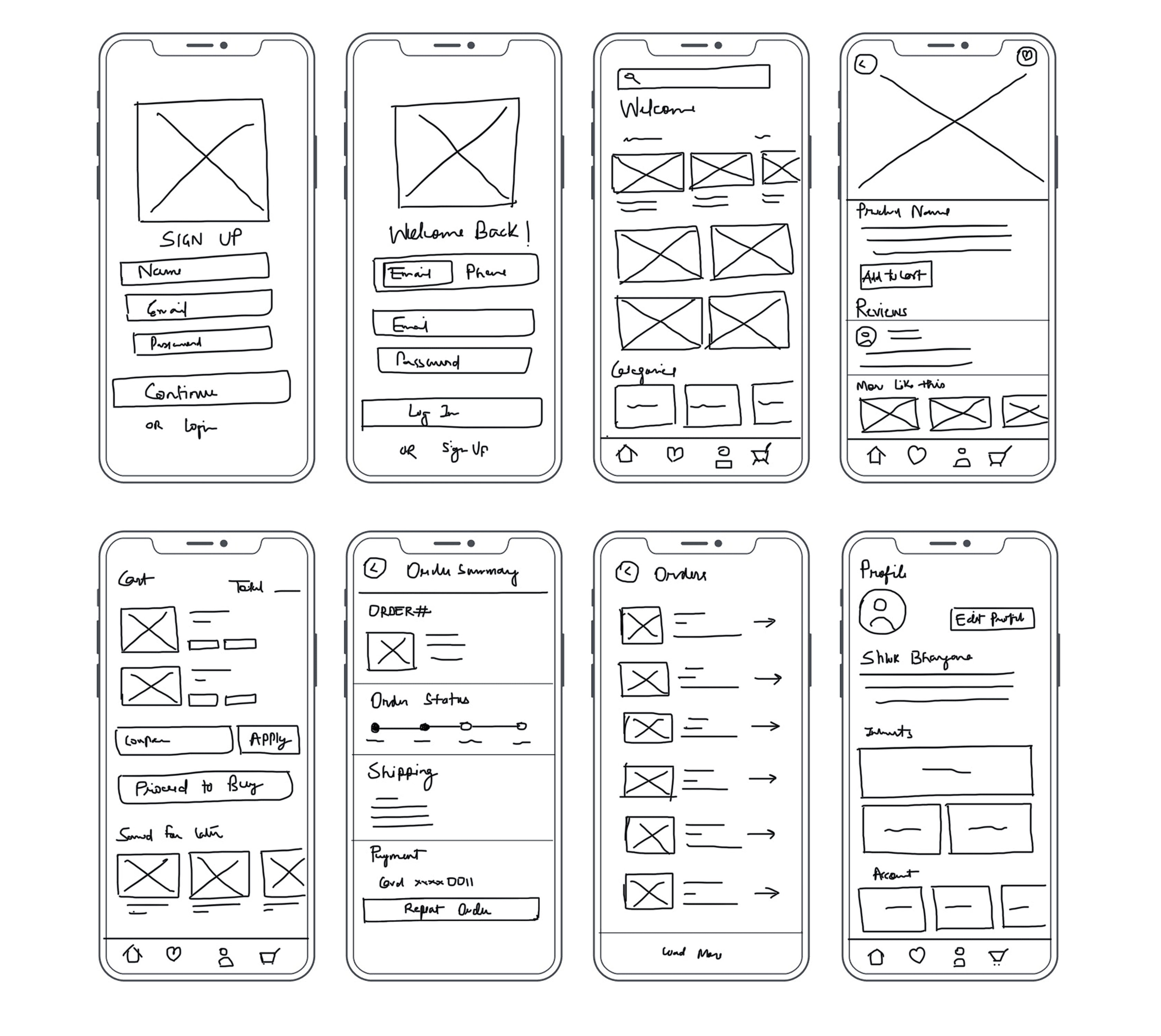
4 & 5. PROTOTYPE & TEST
Understanding that design and testing are iterative, I adopted a design-test-redesign cycle.
Low-Fidelity Prototypes: Using the user flow map, I created wireframes to visualize the structure.
User Feedback: Testing with a small group of users helped identify gaps, like unclear CTAs and overloaded product pages.
High-Fidelity Designs: Incorporating feedback, I refined the wireframes into polished, clickable prototypes.
The final visual designs emphasized clarity, accessibility, and engagement.

KEY DESIGN DECISIONS AND THEIR IMPACT
Home Screen: Added a menu icon for categorized browsing, a notification icon for updates, and bottom navigation for consistent, seamless access.
Product Page:
Product carousel: Positioned at the top to highlight visuals, as users tend to scan images first.
Product details and variants: Organized clearly to reduce decision fatigue.
Strong "Buy Now" CTA: Placed prominently to encourage immediate action.

OVERVIEW
As a practice exercise to understand and refine the UX process, I designed a user-friendly e-commerce application. This hypothetical case study allowed me to approach a problem holistically using the 5-step UX design process: Empathize, Define, Ideate, Prototype, and Test. The goal was to ensure a seamless and delightful user experience while solving user pain points.
WHY E-COMMERCE?
E-commerce platforms are pivotal in today’s digital economy, and the user experience on these sites can make or break a business.
I chose this domain because it offers a variety of challenges—ensuring a seamless user journey, reducing friction during product discovery, and driving conversions through compelling design elements.
By working on this case study, I aimed to tackle real-world challenges that e-commerce businesses face in engaging and retaining customers.
PROBLEM STATEMENT
Online shoppers often face challenges such as overwhelming interfaces, difficulty navigating to desired products, and unclear purchase flows, which lead to frustration and abandoned carts. The goal of this project is to design an intuitive e-commerce experience that simplifies navigation, provides clear product information, and streamlines the purchase process to enhance user satisfaction and drive conversions.
PROCESS & APPROACH
I followed the 5-step UX process—Empathize, Define, Ideate, Prototype, and Test—to create a seamless e-commerce experience. By understanding user needs through empathy mapping I defined key pain points, like complicated navigation. I then ideated a clear user flow, focusing on intuitive navigation and simplified choices. Using low and high-fidelity prototypes, I iterated based on user feedback, adhering to UX laws like Fitts’s and Hick’s Law to ensure usability and efficiency.
1. EMPATHIZE
To step into the users' shoes, I created an empathy map by considering myself as the target audience. Key insights included:
Seamless navigation and quick access to products are critical for a good experience.
Users often feel overwhelmed by cluttered interfaces.
These insights helped me define the foundation for a clean, minimal design focused on ease of use.
2. DEFINE
Based on the empathy map, I identified some common key pain points including navigation struggles, clarity of information, friction in purchase flow etc.
3. IDEATE
To address these pain points, I crafted a user flow map that outlined the entire journey from landing on the app to completing a purchase. Key elements of the user journey:
Easy access to core features through bottom navigation on all screens.
A well-structured home screen with a menu and notification icon for engagement.
Clear segmentation of the product page, highlighting critical sections like images, descriptions, variants, and a prominent "Buy Now" CTA.
4 & 5. PROTOTYPE & TEST
Understanding that design and testing are iterative, I adopted a design-test-redesign cycle.
Low-Fidelity Prototypes: Using the user flow map, I created wireframes to visualize the structure.
User Feedback: Testing with a small group of users helped identify gaps, like unclear CTAs and overloaded product pages.
High-Fidelity Designs: Incorporating feedback, I refined the wireframes into polished, clickable prototypes.
The final visual designs emphasized clarity, accessibility, and engagement.
KEY DESIGN DECISIONS AND THEIR IMPACT
Home Screen: Added a menu icon for categorized browsing, a notification icon for updates, and bottom navigation for consistent, seamless access.
Product Page:
Product carousel: Positioned at the top to highlight visuals, as users tend to scan images first.
Product details and variants: Organized clearly to reduce decision fatigue.
Strong "Buy Now" CTA: Placed prominently to encourage immediate action.