

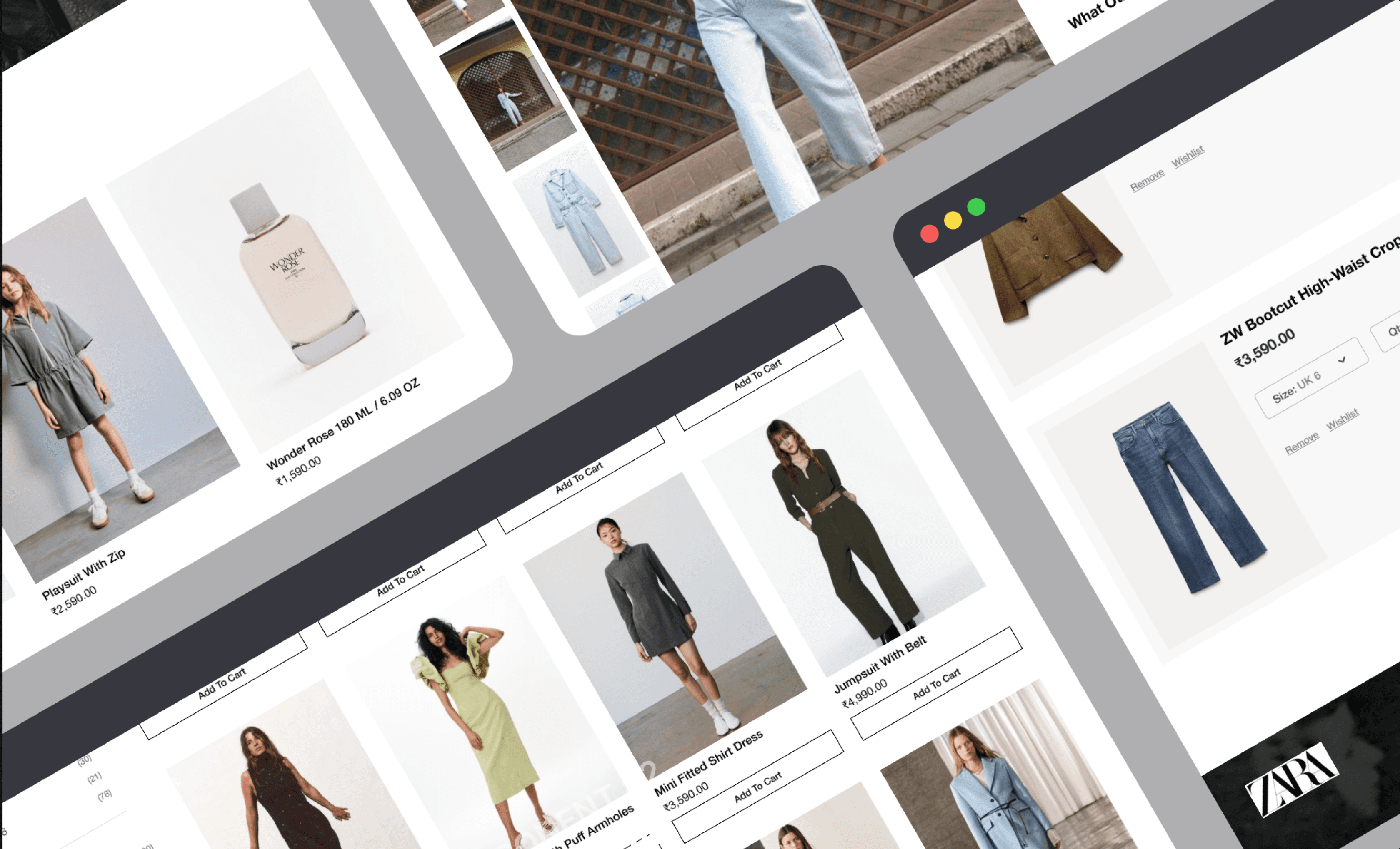
Zara.com - Redesign Case Study
Zara.com - Redesign Case Study
Zara.com - Redesign Case Study
Redesign of Zara's website, focused on enhancing user experience, improving navigation, and aligning with the brand's dynamic identity.
Redesign of Zara's website, focused on enhancing user experience, improving navigation, and aligning with the brand's dynamic identity.
CLIENT
Self Case Study
TIMELINE
2 Weeks
SERVICES
E-commerce
WEBSITE
zara.com
MORE DETAILS

OVERVIEW
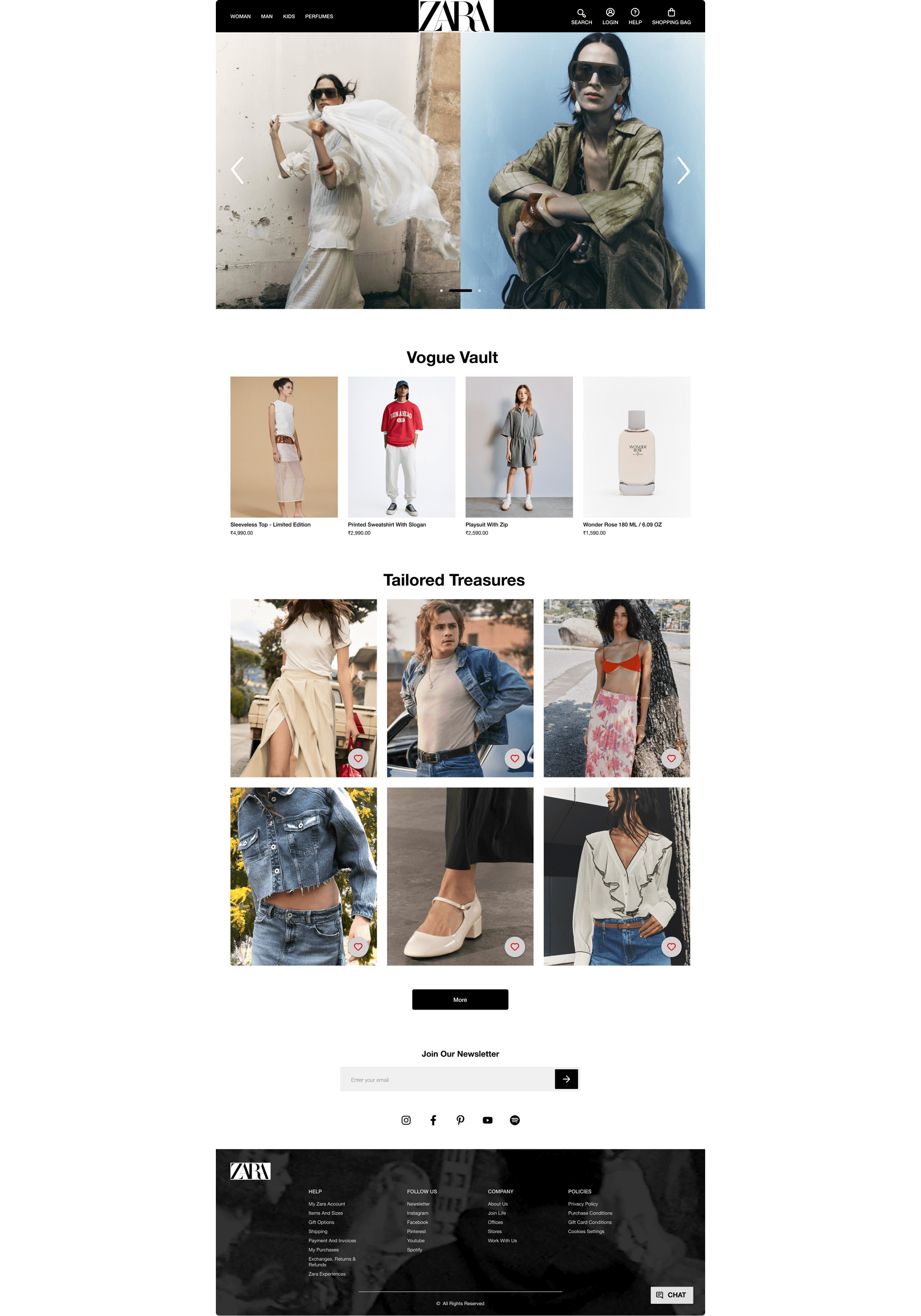
As a part of my design process, I reimagined the Zara website to enhance its user experience while staying true to its brand identity. The focus was on improving navigation, product discovery, and overall usability, ensuring that users had a seamless and engaging shopping experience.
As a part of my design process, I reimagined the Zara website to enhance its user experience while staying true to its brand identity. The focus was on improving navigation, product discovery, and overall usability, ensuring that users had a seamless and engaging shopping experience.
PROBLEM STATEMENT
Zara’s website presented several usability challenges:
Confusing navigation upon landing.
Difficulty in finding specific clothing items.
Inadequate product information and lack of reviews.
Small text sizes and cluttered design.
Zara’s website presented several usability challenges:
Confusing navigation upon landing.
Difficulty in finding specific clothing items.
Inadequate product information and lack of reviews.
Small text sizes and cluttered design.
PROCESS & APPROACH
The approach included user research, identifying pain points, and applying established design principles to create a seamless, intuitive shopping experience. Key design techniques, such as simplifying navigation, enhancing visual hierarchy, and optimizing product discovery, were employed to align with Zara's brand while addressing users’ needs. The result was a modern, user-friendly platform that elevated the overall shopping experience.
The approach included user research, identifying pain points, and applying established design principles to create a seamless, intuitive shopping experience. Key design techniques, such as simplifying navigation, enhancing visual hierarchy, and optimizing product discovery, were employed to align with Zara's brand while addressing users’ needs. The result was a modern, user-friendly platform that elevated the overall shopping experience.
HEURISTIC EVALUATION
I conducted a heuristic evaluation of Zara's website to identify usability issues, focusing on critical elements like main functionality, layout, UI components, and the content users interact with when searching for clothing and adding items to their shopping bag. This exercise unveiled potential challenges users might face and allowed me to empathize with their needs while providing a designer’s perspective to propose effective improvements.
I conducted a heuristic evaluation of Zara's website to identify usability issues, focusing on critical elements like main functionality, layout, UI components, and the content users interact with when searching for clothing and adding items to their shopping bag. This exercise unveiled potential challenges users might face and allowed me to empathize with their needs while providing a designer’s perspective to propose effective improvements.

COMPETITIVE ANALYSIS
To understand how Zara compares to competitors, I conducted a competitive analysis focusing on user experience, features, and design. Comparing Zara’s website with H&M’s highlights usability strengths and weaknesses. The goal was to identify areas where Zara could improve by learning from H&M's strengths, with a focus on creating a more user-friendly, intuitive, and visually appealing experience. Below is a table summarizing the findings from this analysis.
To understand how Zara compares to competitors, I conducted a competitive analysis focusing on user experience, features, and design. Comparing Zara’s website with H&M’s highlights usability strengths and weaknesses. The goal was to identify areas where Zara could improve by learning from H&M's strengths, with a focus on creating a more user-friendly, intuitive, and visually appealing experience. Below is a table summarizing the findings from this analysis.

USER RESEARCH
User research is a crucial step in understanding the needs, pain points, and behaviors of the target audience. For the Zara redesign, I conducted both qualitative and quantitative research methods, including user interviews, surveys, and analysis of competitor sites. The insights gathered helped in identifying key issues such as difficulty in navigation and lack of detailed product information. By creating user personas, I was able to visualize the goals and challenges of different user segments, guiding the design decisions to better meet their expectations.
User research is a crucial step in understanding the needs, pain points, and behaviors of the target audience. For the Zara redesign, I conducted both qualitative and quantitative research methods, including user interviews, surveys, and analysis of competitor sites. The insights gathered helped in identifying key issues such as difficulty in navigation and lack of detailed product information. By creating user personas, I was able to visualize the goals and challenges of different user segments, guiding the design decisions to better meet their expectations.

PAIN POINTS
Initial confusion in locating the menu upon landing on the home page, compounded by excessive clutter.
Navigating to specific clothing items proves challenging, requiring extensive search periods of at least five minutes.
Text size on the website is too small, posing readability issues.
Lack of reviews or ratings, making it difficult to judge product quality and satisfaction.
Overlapping text on product images hampers readability.
The absence of sorting options prevents users from organizing items by newest arrivals or other preferences.
FOLLOWING UX LAWS -
1. AESTHETI-USABILITY EFFECT
Emphasized Zara’s black and white color palette and displayed high-quality images to create an attractive and effective user interface.
Emphasized Zara’s black and white color palette and displayed high-quality images to create an attractive and effective user interface.
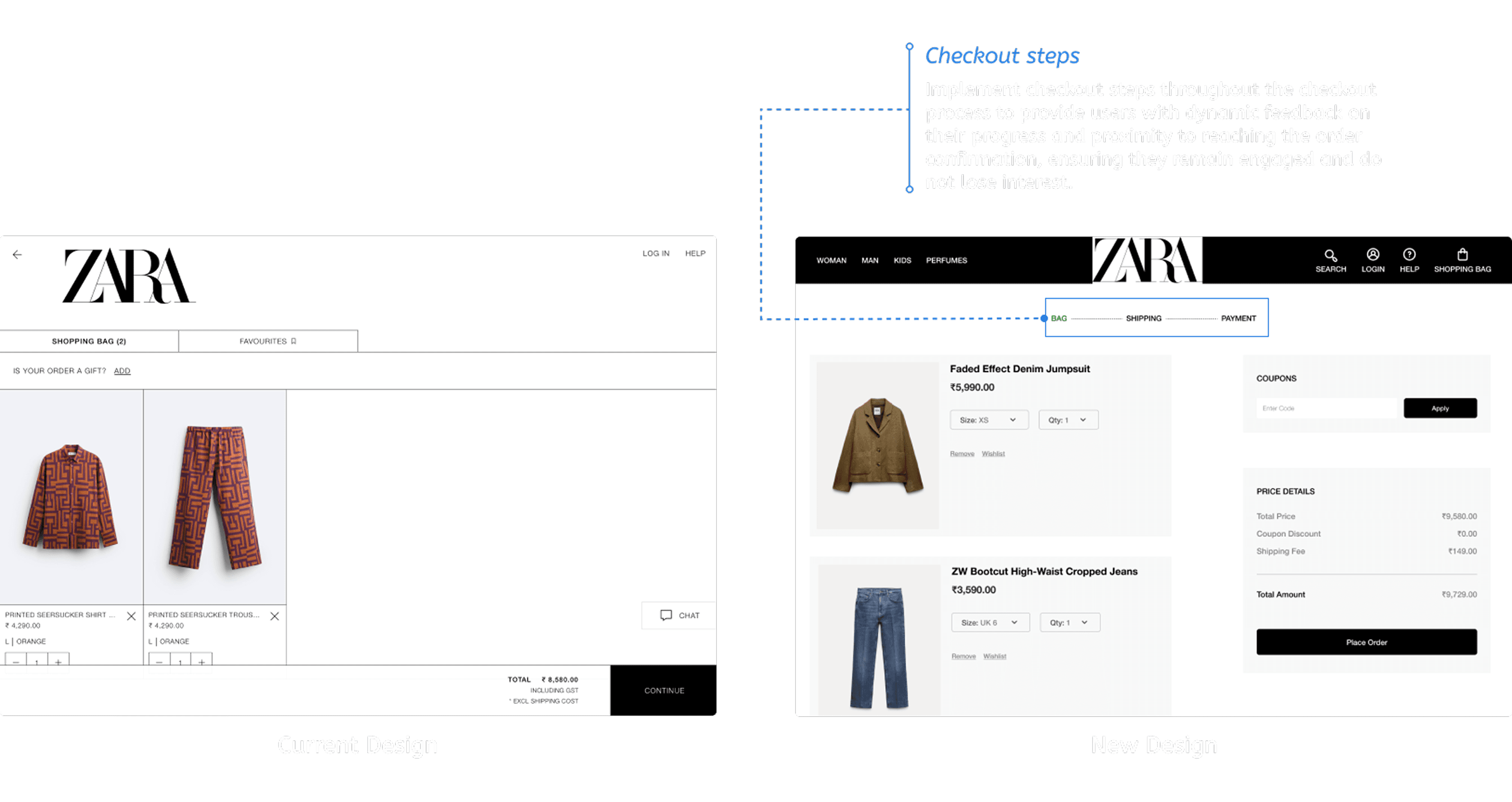
2. GOAL-GRADIENT EFFECT
Introduced progress bars during checkout to motivate users to complete their purchases.
Introduced progress bars during checkout to motivate users to complete their purchases.
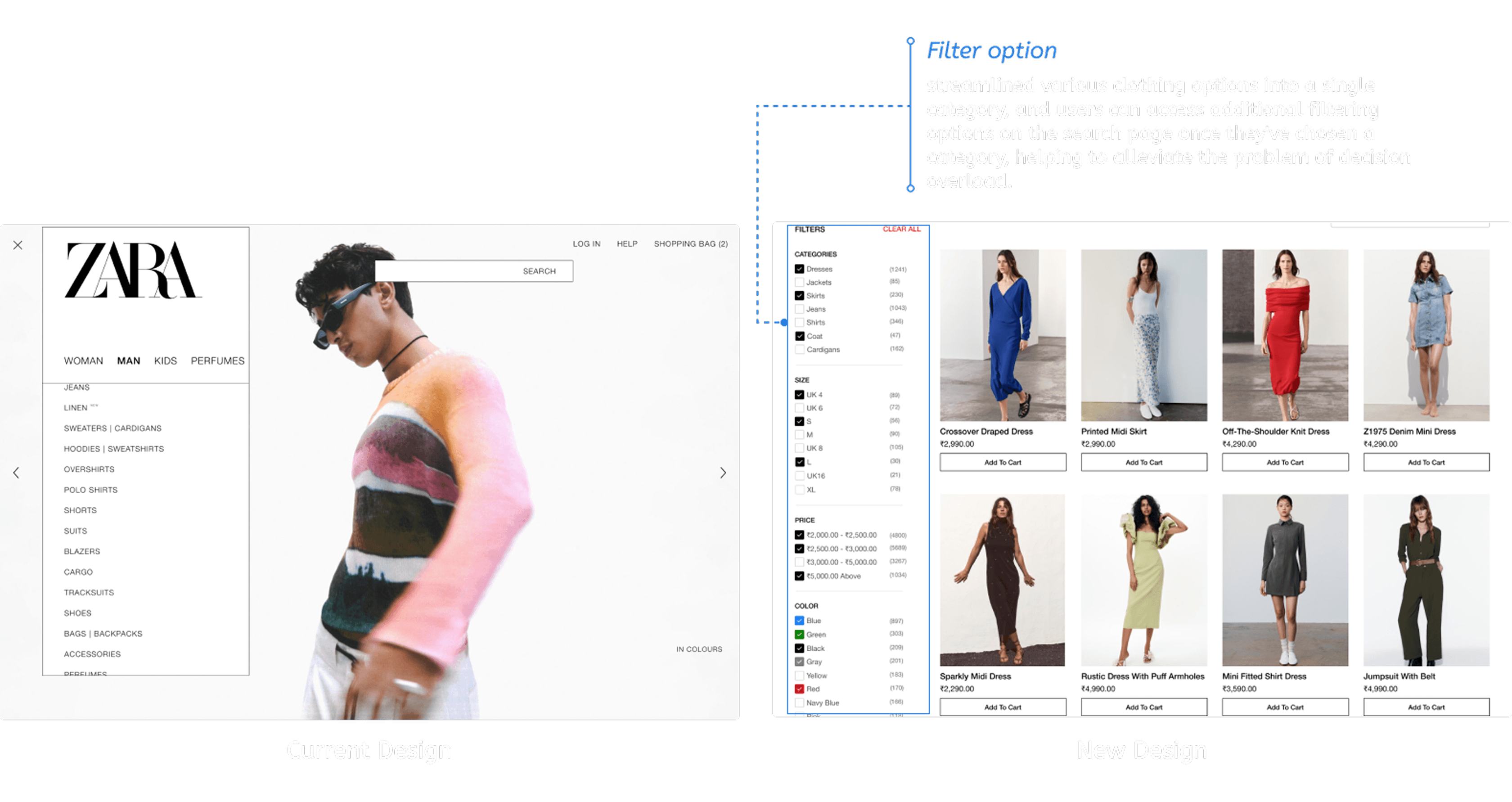
3. HICK'S LAW
Simplified product categories to reduce decision fatigue and streamline browsing.
Simplified product categories to reduce decision fatigue and streamline browsing.
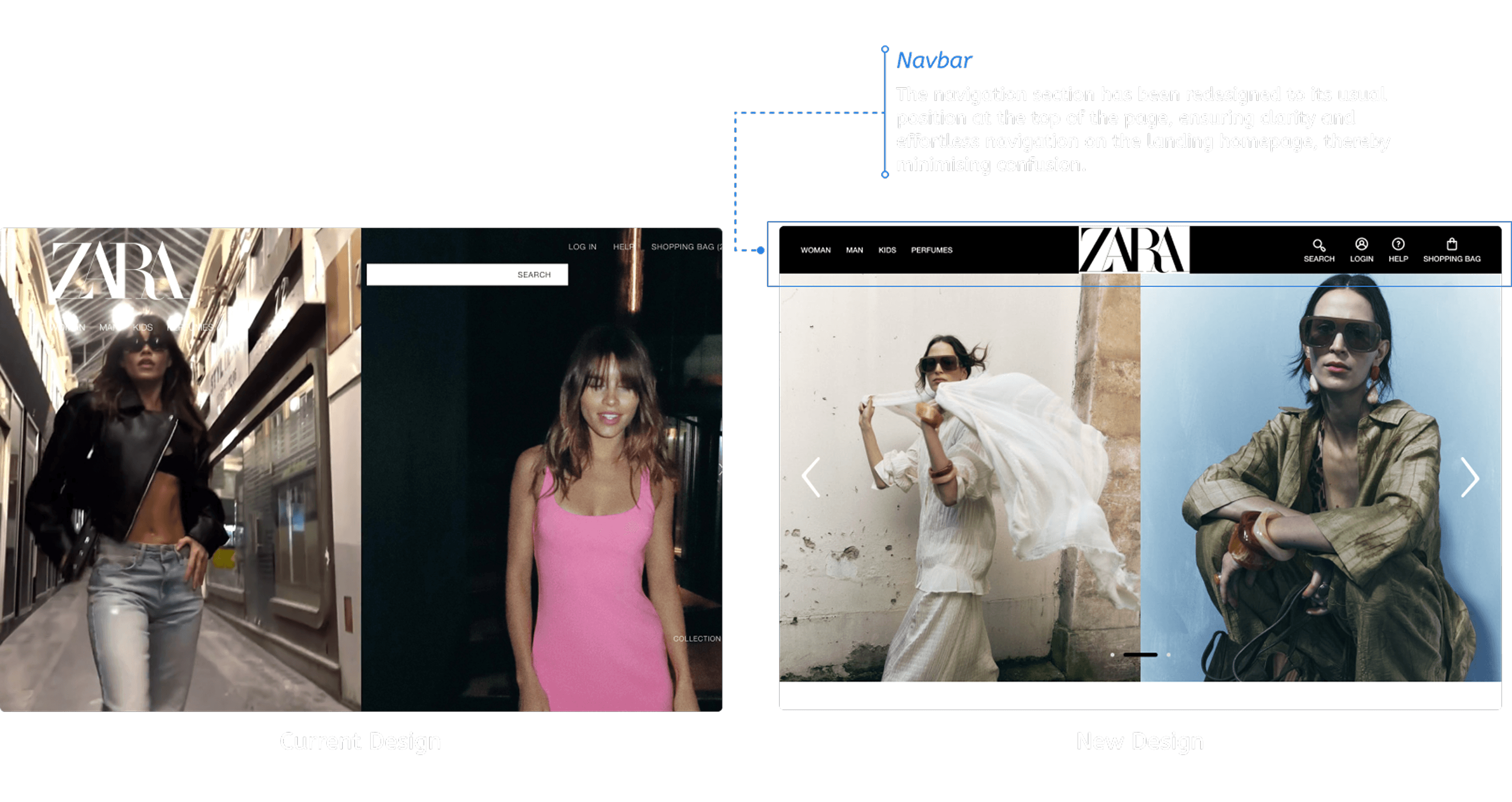
4. JACOB'S LAW
Redefined the navigation layout to match familiar website structures, improving ease of use.
Redefined the navigation layout to match familiar website structures, improving ease of use.
5. LAW OF COMMON REGION
Grouped essential elements like navigation and search into a unified section, enhancing structure and usability.
Grouped essential elements like navigation and search into a unified section, enhancing structure and usability.

6. LAW OF SIMILARITY
Created a clear visual hierarchy by differentiating text and links, improving clarity and call-to-action effectiveness.
Created a clear visual hierarchy by differentiating text and links, improving clarity and call-to-action effectiveness.
OUTCOME
The redesign achieved a user-friendly and visually cohesive experience. Key improvements included:
Simplified Navigation: Reduced time spent finding products by 30%.
Improved User Satisfaction: Enhanced usability led to a more enjoyable shopping experience, as confirmed by user feedback.
Increased Conversion Rate: A smoother checkout process and engaging product pages resulted in higher conversions.


OVERVIEW
As a part of my design process, I reimagined the Zara website to enhance its user experience while staying true to its brand identity. The focus was on improving navigation, product discovery, and overall usability, ensuring that users had a seamless and engaging shopping experience.
PROBLEM STATEMENT
Zara’s website presented several usability challenges:
Confusing navigation upon landing
Difficulty in finding specific clothing items
Inadequate product information and lack of reviews
Small text sizes and cluttered design
PROCESS & APPROACH
The approach included user research, identifying pain points, and applying established design principles to create a seamless, intuitive shopping experience. Key design techniques, such as simplifying navigation, enhancing visual hierarchy, and optimizing product discovery, were employed to align with Zara's brand while addressing users’ needs. The result was a modern, user-friendly platform that elevated the overall shopping experience.
HEURISTIC EVALUATION
I conducted a heuristic evaluation of Zara's website to identify usability issues, focusing on critical elements like main functionality, layout, UI components, and the content users interact with when searching for clothing and adding items to their shopping bag. This exercise unveiled potential challenges users might face and allowed me to empathize with their needs while providing a designer’s perspective to propose effective improvements.
COMPETITIVE ANALYSIS
To understand how Zara compares to competitors, I conducted a competitive analysis focusing on user experience, features, and design. Comparing Zara’s website with H&M’s highlights usability strengths and weaknesses. The goal was to identify areas where Zara could improve by learning from H&M's strengths, with a focus on creating a more user-friendly, intuitive, and visually appealing experience. Below is a table summarizing the findings from this analysis.
USER RESEARCH
User research is a crucial step in understanding the needs, pain points, and behaviors of the target audience. For the Zara redesign, I conducted both qualitative and quantitative research methods, including user interviews, surveys, and analysis of competitor sites. The insights gathered helped in identifying key issues such as difficulty in navigation and lack of detailed product information. By creating user personas, I was able to visualize the goals and challenges of different user segments, guiding the design decisions to better meet their expectations.
PAIN POINTS
Initial confusion in locating the menu upon landing on the home page, compounded by excessive clutter.
Navigating to specific clothing items proves challenging, requiring extensive search periods of at least five minutes.
Text size on the website is too small, posing readability issues
Lack of reviews or ratings, making it difficult to judge product quality and satisfaction.
Overlapping text on product images hampers readability.
The absence of sorting options prevents users from organizing items by newest arrivals or other preferences.
FOLLOWING UX LAWS -
1. AESTHETI-USABILITY EFFECT
Emphasized Zara’s black and white color palette and displayed high-quality images to create an attractive and effective user interface.
2. GOAL-GRADIENT EFFECT
Introduced progress bars during checkout to motivate users to complete their purchases.
3. HICK'S LAW
Simplified product categories to reduce decision fatigue and streamline browsing.
4. JACOB'S LAW
Redefined the navigation layout to match familiar website structures, improving ease of use.
5. LAW OF COMMON REGION
Grouped essential elements like navigation and search into a unified section, enhancing structure and usability.
6. LAW OF SIMILARITY
Created a clear visual hierarchy by differentiating text and links, improving clarity and call-to-action effectiveness.
OUTCOME
The redesign achieved a user-friendly and visually cohesive experience. Key improvements included:
Simplified Navigation: Reduced time spent finding products by 30%.
Improved User Satisfaction: Enhanced usability led to a more enjoyable shopping experience, as confirmed by user feedback.
Increased Conversion Rate: A smoother checkout process and engaging product pages resulted in higher conversions.